Chartjunk
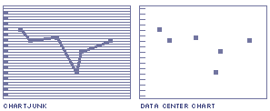
"The interior decoration of graphics generates a lot of ink that does not tell the viewer anything new. The purpose of decoration varies - to make the graphic appear more scientific and precise, to enliven the display, to give the designer an opportunity to exercise artistic skills. Regardless of its cause, it is all non-data-link or redundant data-ink, and it is often chartjunk. Graphical decoration, which prospers in technical publications as well as in commercial and media graphics, come cheaper than the hard work required to produce intriguing numbers and secure evidence.
Sometimes the decoration is thought to reflect the artist's fundamental design contribution, capturing the essential spirit of the data and so on. Thus principles of artistic integrity and creativity are invoked to defend - even to advance - the cause of chartjunk. There are better ways to portray spirits and essences than to get them all tangled up with statistical graphics.
Fortunately most chartjunk does not involve artistic considerations. It is simply conventional graphical paraphernalia routinely added to every display that passes by: over-buy grid lines and excess ticks, redundant representations of the simplest data, the debris of computer plotting, and many of the devices generating design variation."
The Visual Display of Quantitative Information by Edward Tufte
See Signal-to-Noise Ratio